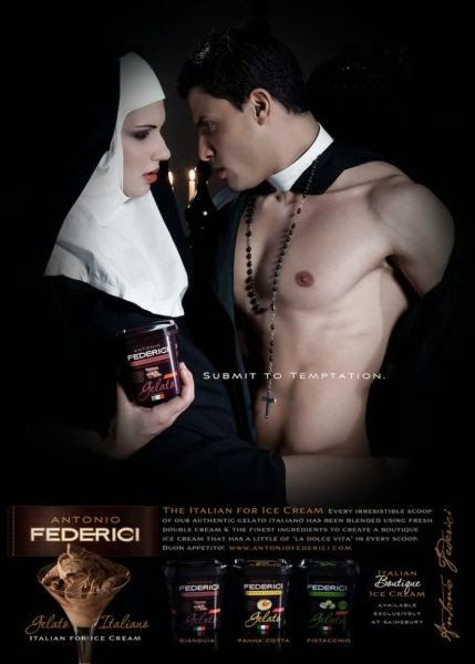
 As a form of art and a
media for creative expression, marketers believe that ads should be artistic,
challenging, and iconic. We are lucky to live in today’s world where people
seem to provide a big place for freedom of expression. However, we cannot deny
that some works of art, as well as some stuff for ads, are still unacceptable
for some people. British ice cream manufacturer Antonio Federici, for instance,
is a victim of advertising campaign ban due to religious sensitivities. With
its tagline, “Submit to Temptation”, the ad features a priest and a nun getting
intimate each other while holding Antonio Federici ice cream. According to
Advertising Standard Authority, the UK’s independent regulator for advertising
across all media, the ad causes serious offence on the ground of religion,
especially for Roman Catholic believers. In Semiotic analysis, we know the
concepts of denotation and connotation which are commonly recognized as first
and second levels of meaning in a sign. As I was trying to analyze the controversial
ad, I found out three signs representing myth, an ideology the advertiser intends
to convey through the ad. They are the imagery of a priest, the imagery of a
nun, and the written tagline.
As a form of art and a
media for creative expression, marketers believe that ads should be artistic,
challenging, and iconic. We are lucky to live in today’s world where people
seem to provide a big place for freedom of expression. However, we cannot deny
that some works of art, as well as some stuff for ads, are still unacceptable
for some people. British ice cream manufacturer Antonio Federici, for instance,
is a victim of advertising campaign ban due to religious sensitivities. With
its tagline, “Submit to Temptation”, the ad features a priest and a nun getting
intimate each other while holding Antonio Federici ice cream. According to
Advertising Standard Authority, the UK’s independent regulator for advertising
across all media, the ad causes serious offence on the ground of religion,
especially for Roman Catholic believers. In Semiotic analysis, we know the
concepts of denotation and connotation which are commonly recognized as first
and second levels of meaning in a sign. As I was trying to analyze the controversial
ad, I found out three signs representing myth, an ideology the advertiser intends
to convey through the ad. They are the imagery of a priest, the imagery of a
nun, and the written tagline.
In order to understand
the myth, first of all, a researcher needs to take a look at the denotative
meaning of the ad. Related to the imagery of a priest, the ad shows the image of
a nearly topless priest wearing a rosario necklace and staring at the nun
sharply. The priest wears a robe that is torn in pattern, which enables ad viewers
to see his muscular body. In regards to the imagery of a nun, the ad presents
the image of a nun staring at the priest sensually, wrapping her right foot
around the priest’s waist. The nun also holds Antonio Federici ice cream in her
right hand at the same time. The last sign is the written tagline of Antonio
Federici ice cream “Submit to Temptation”. It simply explains the theme of the
ad, which is temptation.
From the first levels
of meanings in those three signs, we come to the concept of connotation, which
is the second level of meaning in a sign. In regards to the imagery of a priest
in the ad, the signifier, which is also the denotative meaning of the sign,
signifies the impression of being a rebel. Priests are expected to live in
simplicity, which means it is not appropriate for them to behave like the one
in the ad. Besides, people do not usually assume that a priest may have
muscular body. Therefore, the image of the priest’s muscular body covered by
rosario necklace represents the fact that priests are always bounded by expectations
of society. First of all, the image of the rosario necklace indicates that
people suppose priests should not enjoy pleasurable things too much in life.
Besides, from the imagery of nearly topless priest I can conclude the ad is
trying to say that the temptation of Antonio Federici ice cream makes the
priest want to show his true self—in this case that a priest may also have
muscular body—and natural side of human being that he cannot resist the temptation of Antonio Federici ice cream, either.
Related to the imagery
of a nun, the signifier, which is also the denotative meaning of the sign,
signifies the natural sides of women. Women are usually described as sexy and
seductive creatures at the same time. Basically, the ad is trying to say that
the temptation of Antonio Federici ice cream will bring back the natural sides
of women, even for nuns, which are sexy and seductive. Again, the ad intends to
show that the temptation of Antonio Federici is able to influence everyone,
even for nuns, in order to be their true selves. The imagery of the nun staring
at the priest sensually conveys the sexy side of women, whereas the imagery of
the nun wrapping her right foot around the priest’s waist signifies the
seductive side of women.
In regards to the
written tagline, “Submit to Temptation”, I conclude that it is the sign which
may summarize the basic idea of the ad. Basically, the advertiser seems to use
the imagery of a ‘misbehaved’ priest and a nun in order to signify the strong
temptation Antonio Federici ice cream offers, which even influences those we
may regard as saints in today’s world.
Every advertisement
has a myth, which is the ideology the advertiser intends to convey through the
ad. From this semiotic analysis on the ad of Antonio Federici ice cream, I can conclude
that the imagery of the ‘misbehaved’ priest and nun conveys the idea that the
strong temptation of Antonio Federici ice cream even makes a priest or a nun,
who is supposed to be a leader and role model for religious life, cannot deny
it. It indicates that the taste of Antonio Federici ice cream is so tempting
that it may influence everyone, even priests and nuns who are supposed to live
in simplicity. In conclusion, the myth of this advertisement is that the
temptation Antonio Federici ice cream offers is so big and undeniable that it
makes all people want to enjoy it, no matter who they are.
Even though the ad is
controversial and unacceptable for some people in the world, I think Antonio
Federici company does it very well in sense of conveying its ideology in order
to advertise the product. The written tagline “Submit to Temptation” and the
imagery of the ‘misbehaved’ priest and nun work very well so that people can
get a vivid picture in their mind about how it feels like having a glass of
Antonio Federici ice cream in leisure time. What most of people fail to
recognize is that in order to get the message of a controversial ad, we need to
have a positive thinking. For me, this ad does not insult Roman Catholic faith.
In a way, it just shows the fact that a priest and a nun are somehow still
humans who are likely to get tempted by ‘enjoyable’ things. For me, it is just
a general truth everyone should accept. By this controversial concept, ad
viewers can get the message of the ad clearly. Most of all, for me the
advertiser of Antonio Federici company is very genius in creating a massive
concept that surely makes ad viewers feel the temptation of the ice cream from
their own eyes through those three signs used in the ad.
No comments:
Post a Comment